Interactive Design - Exercises
22.04.2024 - 14.05.2024
Graciella Limpah / 0364517

Usability : Designing Products for User Satisfaction
Interactive Design / Bachelor of Design (Honours) in Creative Media /
Taylors University
Task 1 - Exercises

LECTURES
Usability refers to how easily and effectively a user can operate a product or design in a given situation. It's a crucial aspect of User Experience (UX) Design, representing the second tier of UX Design. The usability of a design hinges on its ability to cater to users' needs and contexts effectively.
Key Principles of Usability:
- Consistency: Ensuring consistency across visual elements and functions in web design is paramount. Consistency guarantees a cohesive appearance and seamless operation throughout different parts of a website, such as headers, footers, sidebars, and navigation bars. A consistent design fosters intuitiveness.
- Simplicity: User interfaces should strive for simplicity. This entails minimizing the number of steps required for tasks, employing clear symbols and terminology for easy comprehension, and reducing the likelihood of errors. Integrating simplicity into designs aids in creating smoother user interfaces and enhancing user experience.
- Visibility: The principle of visibility asserts that elements that are more visible are more likely to be noticed and utilized by users. Conversely, items that are less visible are harder for users to discover and interact with. Users should be able to discern their options and how to access them at a glance.
- Feedback: Feedback is crucial for communicating the outcome of user interactions, making it visible and understandable. Its role is to provide users with indications of success or failure in task performance. For instance, hovering over navigation items on desktops or laptops should trigger color changes or submenu displays, providing users with feedback on their actions.
- Error Prevention: Alerting users to potential errors and facilitating easy correction is essential for preventing mistakes. This principle acknowledges human fallibility and aims to minimize user frustration by guiding them away from errors.
- Complex interfaces
- Confusing navigation
- Poor feedback
- Inadequate error handling
Websites are typically divided into three key elements :
- Header : The header is the top section of a webpage. It usually contains the website's logo, navigation menu, and contact information. The header provides users with quick access to essential information and navigation.
- Body : The body is the main content area of a webpage. It contains text, images, videos, and other multimedia elements. Proper organization of content within the body is crucial for readability.
- Footer : The footer is located at the bottom of a webpage. It typically includes copyright information, links to important pages, and contact details. The footer provides closure to the webpage and additional navigation options.
Content organization is key to a well-structured website. Use headings (H1, H2, H3, etc.) to create a hierarchical structure. Logical grouping of content and clear labeling of sections improve user experience.
Navigation Menus
Navigation menus help users move around the website. Use clear and concise labels for menu items. Consider using dropdown menus for complex sites.
Web Standards
In the early days of the Web, everyone accessed the Web using a keyboard,
mouse, and monitor. Today, there is much more variety in the ways people
access the Web. Many people do so on their phones or other pocket mobile
devices. Many people do so on tablet computers with touch screen interfaces
instead of keyboards and mice. Some people access the web through audible
interfaces (they talk to the computer, or they listen to the computer talk to
them, or both). Many people who are blind depend on speech output, and people
who are unable to use their hands depend on speech input.
Why Web Standards?


- To make internet a better place, for both developers and visitors, it is important that both browsers and Web developers follow the Web standards.
- When developers follow the Web standards, the development is simplified, since it is easier for a developer to understand another's coding.
- Using Web standards will ensure that all browsers will display your Web site properly, without time-consuming rewrites.
How the web work
- When you connect to the web, you do so via an ISP. You type a domain name or web address into your browser to visit a site; eg: www.google.com, www.bbc.co.uk
- Your computer contacts a network of servers called DNS servers. These act like phone book; they tell your computer the IP address associated with the requested domain name. Every device on the web has a unique IP address; it’s like the telephone number for that computer.
- The unique number that the DNS server returns to your computer allows your browser to contact the web server that hosts the website you requested. A web server is a computer that is constantly connected to the web, and is set up especially to send web pages to users.
- The web server then sends the page you requested back to your web browser
HTML describes the structure of pages
The HTML code is made up of characters that live inside angled brackets
<>. These are called HTML elements. Elements are usually made up
of two tags: an opening tag and a closing tag
<element>Information</element>
Each element tells the browser something about the information that sits
between its opening and closing tags.


fig 0.1 Closer look at tags
Attributes tell us more about the elements
Attributes provide additional information about the contents of an element.
They appear on the opening tag of the element and are made up of two parts: a
name and a value, separated by an equals sign.

|
| fig 0.2 Attributes |
The attribute name indicates what kind of extra information you are supplying about the element’s content. It should be written lowercase.
The value is the information or setting for the attribute. It should be placed in double quotes. Different attributes can have different value.
Here an attribute called lang is used to indicate the language used in this element. The value of this attribute on this page specifies it is in US English.
You met the <body> element in the first example created. Everything inside this element is shown inside the main browser window.
<head>
Before the <body> element you will often see a <head> element. This contain information about the page. You will usually find a <title> element inside the <head> element.
<title>
The contents of the <title> element are either shown in the top of the browser (tab bar).
To create a paragraph, surround the words that make up the paragraph with an
opening <p> tag and closing </p> tag.
By enclosing words in the tags <b> and </b>
we can make characters appear bold. The <b> element also represents a section of text that would be presented in a visually different way (for example key word in a paragraph) although the use of <b> element does not imply any additional meaning.
By enclosing words in the tags <i> and </i> we can make
characters appear italic. The <i> element also represents a
section of text that would be said in a different way from surrounding
content- such as technical terms, names of ships, foreign words,
thoughts, or other terms that would usually be italicised.
There are lots of occasions when we need to use lists. HTML provides us with two different types:
-
Ordered list are lists where each item in the list
is numbered. List is for set of steps for a recipe
that must be performed in order
- Unordered list are list that begin with a bullet point
Lists
<ol>
The ordered list is created with the <ol> element
<li>
Each
item in the lis is placed between and opening <li> tag and a
closing </li> tag (the li stands for list item.)
<ul>
The unordered list is created with the <ul>
element
<li>
Each item in the lis is placed
between and opening <li> tag and a closing </li> tag (the
li stands for list item.)
Nested Lists
You can put a second list inside an <li> element to create a
sub-list or nested list. Browsers display nested lists indented
further that the parent list. In nested unordered lists, the browser
will usually change the style of the bullet too.
Writing Links
Links are created using the <a> element. User can click on
anything between the opening<a> tag and the closing </a>
tag. Specify which page to link using the href attribute.

fig 0.3 Writing Links
Linking to other sides
<a>
Links are created using the <a> element which has an attribute
called href. The value of the href attributes is the page that you
want user to go to when they click on the link. When you link to a
different website, the value of the href attribute will be the full
web address for the site, also know as an absolute URL. Browsers show
links in blue with an underline by default
Adding images

fig 0.4 Adding images
<img>
The <img> HTML tag serves the purpose of incorporating images
into a web page. In the context of web design, it's important to note
that images are not physically inserted within a web page; instead,
they are linked to it. The <img> tag essentially establishes a
designated space for displaying the referenced image. It's worth
mentioning that the <img> tag itself is void of content and is
solely comprised of attributes, eliminating the need for a closing
tag.
When using the <img> tag, two essential attributes must
be included:
src - This attribute specifies the path to the
image.
alt - This attribute provides alternative text for the
image, which is essential for accessibility
Title - This
attribute provides tool tip of the image in the browser
ID and Class attribute
ID attribute
Every HTML element can carry the ID attribute. It is used to uniquely
identify the element from other elements on the page. It is important
that no two elements have the same value for their ID attributes
(otherwise the value is no longer unique). Giving an element a unique
identity allows you to style it differently from any other instance of
the same element on the page. Eg: you might want to assign one
paragraph within the page a different style from all of the other
paragraphs.
Class attribute
For example, you might have some paragraph of the that contain
information that is more important than others and want to distinguish
between these elements. The class attribute on any elements can share
the same value or name.
By default, using these attributes does not affect the presentation
of an element. It will only change their appearance if there is a CSS
rule that indicates it should be displayed differently.
Inline elements
Some elements will always appear to continue on the same line as
their neighbouring elements. It is know as inline elements. Example:
<b>, <i>, <em>, <a> and <img>.
Cascading Style Sheet
(CSS)
Introducing CSS
CSS allows you to create rules that specify how the content of an
element should appear. Example, you can set the background of the page
is cream, all paragraphs should appear in gray using the Arial
typeface, or that all level header should be in a blue, italic,
Helvetica typeface.
CSS Style Rules with
HTML Elements
CSS works by associating rules with HTML elements. These rules govern
how the content of specified elements should be displayed. A CSS rule
contains two parts : a selector and a declaration.

fig 0.5 CSS style rules with html elements
CSS Properties Affect
how Elements are Displayed
CSS declaration sit inside curly brackets and each is made up of two
parts; a property and a value, separated by a colon. You can specify
several properties in one declarations each separated by a
semi-colon.

fig 0.6 CSS Properties Affect how elements are
displayed
Method to Employ
CSS
Using External
CSS
<link>
The <link> element can be used in an HTML document to tell the
browser where to find the CSS file used to style the page. It is an
empty element and it lives inside the <head> element
It should use three attributes:
-href; To specify the path to the CSS file
-type; This attribute specifies the type of document being linked to.
The value should be text/css
-rel; Specifies the relationship between the HTML page and the file
linked to. The value should be stylesheet when linking to a CSS
file.
An HTML page can use more than one CSS style sheet. To do this it
could have a <link> element for every CSS file it uses. For
example, one authors use one CSS to control the presentation (fonts
and colors) and a second to control the layout.
Using Internal CSS
<style>
You can also include CSS rules within an HTML page by placing them
inside a <style> element, which usually sits inside the
<head> element of the page.
The <style> element should use the type attribute to indicate
that the styles are specified in CSS. The value should be
text/css.
When building a site with more than one page, you should use an
external CSS style sheet. This:
-Allow all pages to use the same style rules (rather than repeating
them in each page)
-Keeps the content separate from how the page looks
-Means you can change the styles used across all pages by altering
just one file (rather than each individual page)
CSS Selectors
-CSS (Cascading Style Sheets) selectors are a fundamental part of CSS
that allow you to target and style HTML elements on a web page.
-Selectors are used to define which elements should receive specific
styles, such as colors, fonts, spacing, and more.
-They are a crucial part of web development because they enable you to
control the presentation and layout of your web pages.
Universal Selector:
Selects all elements on the page. It's represented by an asterisk (*).
Use it with caution, as it can affect all elements and lead to
inefficient CSS.
Element Selector:
The simplest type of selector, it targets HTML elements by their tag
name.
ID Selector:
Targets an element with a specific id attribute. IDs must be unique
within an HTML document. To select an element with a specific ID, use a
# symbol followed by the ID name.
Class Selector:
Targets elements with a specific class attribute. Multiple elements can
share the same class. To select elements with a specific class, use a .
symbol followed by the class name.
Descendant Selector:
Selects an element that is a descendant of another element. You can
specify a hierarchy of elements to target. For example, to style all
<a> elements inside a <div> with class "container,"
Attribute Selector:
Selects elements with a specific attribute value. It is used to styling
elements based on their attributes, such as form inputs.
Syntax: [attribute=value]
Child Selector:
Selects elements that are direct children of another element. To select
only the immediate <li> children of an <ul>, you can use:
ul > li {
list-style:none; } Pseudo-class Selector:
Selects elements based on their state or position in relation to other
elements. Common pseudo-classes include :hover, :active, :visited,
:link, :focus, and :nth-child(n)
Pseudo-element Selector:
Selects parts of an element rather than the element itself. Common
pseudo-elements include ::before and ::after, which are used to add
content before or after an element.
Adjacent Sibling Selector:
Syntax: element + adjacent.
Selects an element that is immediately preceded by a specified element.
Styling an element that directly follows another specific element.
General siblings selector :
Syntax: element ~ siblings.
Selects all elements that are siblings of a specified element.
Styling all sibling elements that follow a specified
element.
- Ordered list are lists where each item in the list is numbered. List is for set of steps for a recipe that must be performed in order
- Unordered list are list that begin with a bullet point
<li>
Each item in the lis is placed between and opening <li> tag and a closing </li> tag (the li stands for list item.)
The unordered list is created with the <ul> element
<li>
Each item in the lis is placed between and opening <li> tag and a closing </li> tag (the li stands for list item.)

|
| fig 0.3 Writing Links |

|
| fig 0.4 Adding images |
<img>
The <img> HTML tag serves the purpose of incorporating images
into a web page. In the context of web design, it's important to note
that images are not physically inserted within a web page; instead,
they are linked to it. The <img> tag essentially establishes a
designated space for displaying the referenced image. It's worth
mentioning that the <img> tag itself is void of content and is
solely comprised of attributes, eliminating the need for a closing
tag.
When using the <img> tag, two essential attributes must be included:
src - This attribute specifies the path to the image.
alt - This attribute provides alternative text for the image, which is essential for accessibility
Title - This attribute provides tool tip of the image in the browser
ID attribute
Every HTML element can carry the ID attribute. It is used to uniquely identify the element from other elements on the page. It is important that no two elements have the same value for their ID attributes (otherwise the value is no longer unique). Giving an element a unique identity allows you to style it differently from any other instance of the same element on the page. Eg: you might want to assign one paragraph within the page a different style from all of the other paragraphs.
Class attribute
For example, you might have some paragraph of the that contain information that is more important than others and want to distinguish between these elements. The class attribute on any elements can share the same value or name.
By default, using these attributes does not affect the presentation of an element. It will only change their appearance if there is a CSS rule that indicates it should be displayed differently.
Inline elements
Some elements will always appear to continue on the same line as their neighbouring elements. It is know as inline elements. Example: <b>, <i>, <em>, <a> and <img>.
Cascading Style Sheet (CSS)
Introducing CSS
CSS allows you to create rules that specify how the content of an element should appear. Example, you can set the background of the page is cream, all paragraphs should appear in gray using the Arial typeface, or that all level header should be in a blue, italic, Helvetica typeface.
CSS Style Rules with HTML Elements
CSS works by associating rules with HTML elements. These rules govern how the content of specified elements should be displayed. A CSS rule contains two parts : a selector and a declaration.

|
| fig 0.5 CSS style rules with html elements |
CSS Properties Affect how Elements are Displayed
CSS declaration sit inside curly brackets and each is made up of two parts; a property and a value, separated by a colon. You can specify several properties in one declarations each separated by a semi-colon.

|
| fig 0.6 CSS Properties Affect how elements are displayed |
Method to Employ CSS
Using External CSS
<link>
The <link> element can be used in an HTML document to tell the browser where to find the CSS file used to style the page. It is an empty element and it lives inside the <head> element
It should use three attributes:
-href; To specify the path to the CSS file
-type; This attribute specifies the type of document being linked to. The value should be text/css
-rel; Specifies the relationship between the HTML page and the file linked to. The value should be stylesheet when linking to a CSS file.
An HTML page can use more than one CSS style sheet. To do this it could have a <link> element for every CSS file it uses. For example, one authors use one CSS to control the presentation (fonts and colors) and a second to control the layout.
Using Internal CSS
<style>
You can also include CSS rules within an HTML page by placing them inside a <style> element, which usually sits inside the <head> element of the page.
The <style> element should use the type attribute to indicate that the styles are specified in CSS. The value should be text/css.
When building a site with more than one page, you should use an external CSS style sheet. This:
-Allow all pages to use the same style rules (rather than repeating them in each page)
-Keeps the content separate from how the page looks
-Means you can change the styles used across all pages by altering just one file (rather than each individual page)
Why There Are Many Selectors
CSS provides a variety of selectors to offer flexibility and
granularity when targeting HTML elements for styling.
The reason for having many different selectors is to give web
developers the ability to precisely target and style specific elements
or groups of elements based on their structure, attributes, state, or
position within the document.
Here are some key reasons why there are so many selectors in CSS:
Specificity
Structure
Attribute-Based Selection
Pseudo-Classes and Pseudo-Elements
Responsive Design
Stateful Interactions
Cross-Browser Compatibility
Ease of Maintenance
Accessibility
INSTRUCTIONS
Week 2 - In class activity
We are separated into groups, then each group are given one topic
to make it a prototype. We are advised to use paper prototype but
using digital is also okay, so my group and I decided to use Adobe
XD for this task. Our topic are to make social media platforms for
one interest, so we choose to make cooking app. In that app, we
can search for recipes and we can also post our own recipes.
Before doing the design part of this task, the main part are to do
the flow and layout to make it easier. With this activity, I know
how to make simple prototype as well as planning the flow.
Week 4 - In Class Activity
We learned to do a simple html program that have our personal
information in it, we also learn how to make the text bold, how to
add pictures, also how to add link into it. Then, we are asked to
upload it to netlify and here is what I have done :
Week 2 - In class activity
We are separated into groups, then each group are given one topic
to make it a prototype. We are advised to use paper prototype but
using digital is also okay, so my group and I decided to use Adobe
XD for this task. Our topic are to make social media platforms for
one interest, so we choose to make cooking app. In that app, we
can search for recipes and we can also post our own recipes.
Before doing the design part of this task, the main part are to do
the flow and layout to make it easier. With this activity, I know
how to make simple prototype as well as planning the flow.
Exercise 1 - Web Analysis
We have to choose two websites from the given
link
and review it, taking notes of its design, layout, content, and
functionality as well as the strengths and weaknesses of the website, and
consider how they impact user experience. We have to also write a brief
report summarizing our findings and recommendations.
What to have in the analysis :
- Purpose and goals of the website, evaluate are they effectively
communicated
- Consider the functionality and usability of the website (navigation,
forms, and interactive elements)
- Evaluate the quality and relevance of the website's content (accuracy,
clarity, and organization)
- Consider website performance (load times, responsiveness and compatibility
with different devices and browsers)
Deliverables :
Write a brief report summarizing in not less than 500 words. You can include
a screen capture of each section or page of the website to explain. Make
sure that the formatting of the report is clear (heading/subheadings).
My two chosen website are
(click here)
and
(click here)
First Website : Ellesse
Website Link : https://www.goldwin.co.jp/ellesse/This website serves as a platform to introduce viewers to Ellesse, a renowned clothing brand originating from Japan, offering a diverse range of fashion items. Its primary objectives are to provide detailed insights into Ellesse products and facilitate seamless access to purchasing via their online store. Additionally, the website showcases various styling options for Ellesse clothing. The clear presentation and accessibility of information suggest that these objectives are effectively communicated to the audience.
Layout, Purpose and Goals
Upon arriving at the website, you are greeted by an animation play that show the fashion categories. The choice of colors and fonts employed throughout the website is particularly pleasing to the eye. Additionally, subtle design elements in the background enhance the overall aesthetic, creating an interactive experience as they respond to cursor movements. Guiding users to key sections such as the online store, about brand information, shop list, brand name, and search bar, all conveniently located at the top of the website. These animations not only enhance the visual appeal but also assist users in navigating the site efficiently. The goal of this website is to elevate the brand's popularity and increase awareness among potential customers.

|
| fig 1.1 Opening page |
Functions
Here are a couple of standout features on the website that caught my attention. Firstly, clicking the arrow icon (fig 1.2) seamlessly redirects us to the online store, making the browsing-to-purchase process simplified. Secondly, the 'microscope' feature allows for a closer look of the fashion items, enhancing the viewing experience with clear, detailed imagery.

|
| fig 1.2 Functions |

|
| fig 1.3 Online stores |

|
| fig 1.4 Functions |
Quality and Relevance
The website works really well in many ways. It keeps its product list updated so you always know what's available. The pictures and symbols all look good together and make the site easy to recognize. When you click on things, they change color smoothly, which is fun. Finding your way around is easy too, thanks to the clear categories. And everything is simple to use, so anyone can navigate the site without any trouble. Plus, the small details like circles or lines add extra charm. For example, the circles animation from the background follow our arrow wherever we go, making the website even more interesting to explore. Overall, the website does a great job making shopping online a breeze while also being enjoyable to use.

|
| fig 1.5 Quality and Relevance |

|
| fig 1.6 Quality and Relevance |
The website's categories are exceptionally clear and thoughtfully organized, making it effortless for viewers to navigate. With clear divisions into various categories, users can quickly find what they're looking for. This organizational structure functions seamlessly, enhancing the user experience.

|
| fig 1.7 Quality and Relevance |

|
| fig 1.8 Categories |
Website Performance
Here's how the website appears on an iPhone. While some layouts may adjust, the information remains consistent. I find it easy to access the website on both my laptop and iPhone. The elements transition perfectly, adapting smoothly to the device's screen size and orientation.
Here's how the website appears on an iPhone. While some layouts may adjust, the information remains consistent. I find it easy to access the website on both my laptop and iPhone. The elements transition perfectly, adapting smoothly to the device's screen size and orientation.


fig 1.9 view from iPhone
Strength and Weakness Strength :
- The website's color palette is remarkably appealing, attracting viewers and enhancing their desire to purchase products.
- The visual elements incorporated into the design are engaging and captivating, adding an entertaining dimension to the browsing experience.
- The clearly defined categories streamline navigation, significantly reducing the time required to locate specific items.
- Navigating this website can pose challenges for non-Japanese speakers due to its predominantly Japanese language.
- Occasional interruptions occur when scrolling, as other websites may unexpectedly appear.
- Certain animations on the site tend to move very slow, causing viewers to be bored. To prevent this, consider replacing slow animations with static images.
- Some text is difficult to read due to poor contrast with the background color, make readability a little difficult.
Second Website : Poison
"Poison" symbolizes a departure from conventional norms and standards, a willingness to challenge existing boundaries, and an embrace of innovation and creativity. It embodies the idea of daring to be different, going the extra mile, and questioning everything in pursuit of new horizons and possibilities in art, business, and the creative industry in general. In essence, "Poison" represents a bold and unconventional approach to creativity and innovation.
Layout, Purpose and Goals
Upon opening the website, I'm immediately drawn to the charming arrow design, resembling a hand and setting a playful tone. The predominant use of black colors gives a sleek feel. Additionally, the interactive color-changing feature upon clicking symbols adds an engaging element. However, there is room for improvement in the layout, particularly with regards to highlighting the introduction more prominently. Despite this, the website's main goal is clear: to help brands unlock their true potential, promising a platform for creative exploration and growth.

|
| fig 2.1 Opening page |

|
| fig 2.2 Layout |
Function
I'm satisfied by the way our cursor changes into different hand shapes, reflecting what we're about to click. The interactive animations, including those we can interact with while scrolling, add an enjoyable dimension to exploring the website. Furthermore, the effortless usability of the member registration form enhances the website's functionality. Additionally, the animations provide a playful touch, almost resembling a game, ensuring visitors remain engaged and entertained each time they access the website.

|
| fig 2.3 Function |

|
| fig 2.4 Log in page |
Quality and Relevance
The website's categories are meticulously organized, allowing users to effortlessly navigate to their desired sections with just a click. Each category is clearly labeled and intuitively arranged, smoothen the browsing experience. Furthermore, all information provided is carefully maintained and regularly updated, ensuring that users have access to the latest and most accurate content. Keeping things well-organized and up-to-date makes users happy and helps them find what they need quickly, which makes the website better for everyone.
The website's categories are meticulously organized, allowing users to effortlessly navigate to their desired sections with just a click. Each category is clearly labeled and intuitively arranged, smoothen the browsing experience. Furthermore, all information provided is carefully maintained and regularly updated, ensuring that users have access to the latest and most accurate content. Keeping things well-organized and up-to-date makes users happy and helps them find what they need quickly, which makes the website better for everyone.

|
| fig 2.5 Categories |
Website Performance
The website adapts well to iPhones, ensuring a smooth user experience. Despite occasional animation lag, it maintains a high standard. This adaptability reflects its commitment to accessibility and user-centric design, welcoming users across devices. While some delays may occur, they're minor compared to its overall performance across platforms, emphasizing its dedication to inclusivity.


fig 2.6 View on iPhone
Strength and Weakness
Strength :
Strength :
- The predominantly black and white color scheme of the website creates a striking contrast, making any additional colors stand out vividly.
- Certain animations and elements on the site are particularly captivating, enticing users to explore further by scrolling through the content.
- The well organized typography enhances the reading experience, obtaining a sense of satisfaction and engagement among visitors.
- The website experiences occasional lagging due to excessive animations, which can impact its smooth performance.
- The presence of watermarks on the mobile version of the site can create a sense of unease for users.
- Placing the login page at the end of the website may lead to users overlooking it, resulting in decreased awareness of its existence.
- Certain animations positioned behind text elements can effect readability, making it challenging for users to engage with the content effectively.
Exercise 2 - Web Replication
After knowing the layout of website, we are asked to replicate 2 website from
the given 3 website in google classroom. We can use adobe illustrator or
photoshop to do this task. From those 3 website given, the website I chose are
(click here)
and
(click here). First, we are asked to screen graph the website using google chrome.
.png)
.png)
fig 3.1 Screen graph website
Then, I started to find similar images to put in to the website, as well as
fonts. As for both of these website, I commonly use "Helvetica". Here are some
of the images I used.

|
| fig 3.2 Pictures used |
After that, I began my replication by doing my replication above the original website.

|
| fig 3.3 Progress |
Result
The result of the second website :
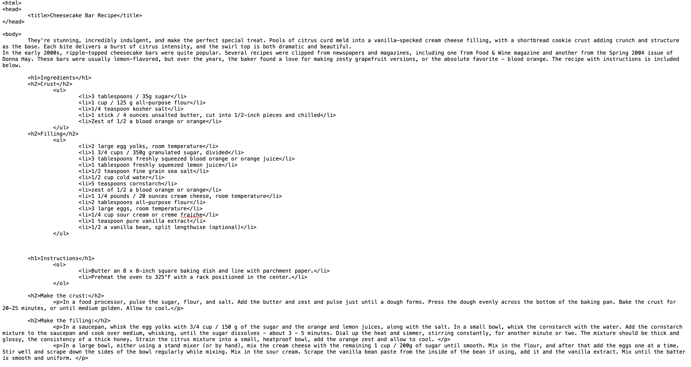
Exercise 3 - Creating a recipe card
In this exercise, you will create a recipe card using HTML and CSS. The goal is
to design a basic webpage that displays a recipe's ingredients and instructions
in a visually appealing format. We are asked to choose recipe from this
link. I choose the recipe for Cheesecake Bar.
Result of the first replication website :

|
| fig 4.1 Replication of the first website |
Comparison :

|
| fig 4.2 Comparison (left side is the real website, right side is the replication) |

|
| fig 4.3 Replication of the second website |
Comparison with the real website :

|
| fig 4.4 Comparison (left side is the real website, right side is the replication) |

|
|
fig 5.1 Cheesecake Bar
|
Then, I start to make a new html file and put in the information and
pictures to it.
|
| fig 5.2 html codes |

|
|
fig 5.3 First Section |

|
| fig 5.4 Second Section |

|
| fig 5.5 Third Section |
Following with the instruction or the step by step of how to make this
dessert. First is making the crust and then make the filling.

|
| fig 5.6 Fourth Section |
This is the last part of the instruction part, which is assemble and bake.

|
|
fig 5.7 Fifth Section |
Layout
I do think the table one is easier to read than the one without table, so I go
with the table one. I am quite happy with the result, I then change the font
and colors to the text and background.
Then, I move into CSS style to make the layout and the color of the recipe
card. First, I change the background color (which I also might change it
later on) and started to do on the first section which is the introduction.
I put the picture float to the left and the text on the right side.

|
| fig 6.1 Layout |
Next, moving to the second section which is ingredients. I look on to google
and learn how to make box in html codes, I figured it out and here is the
result :

|
| fig 6.2 Layout |
For the Instructions part, section 4 and 5, I make it zig-zag for the
pictures and text.

|
| fig 6.3 Layout |
I then added a line to divide them.

|
|
fig 6.4 Layout |
Next, I do the nutritions part, I make it two styles at first, one with
table and one without table to compare which one is more interesting.

|
|
fig 6.5 Layout |

|
| fig 6.6 Changing color and font |
Final Result :
REFLECTION
Experience
As this is my first time learning about program, and how to do
website, as well as learning all the codes, this is interesting
for me. Our first task is to analyze website and for me, that
exercise help me to know more about website, and for the second
exercise, which is replicating website, it makes me aware about
the layout of website. Doing these two exercise is really fun for
me personally.
Observation
I initially underestimated the complexity of HTML code. Even a small
mistake like a missing element can prevent the website from
functioning correctly. This highlights the importance of precision
and attention to detail. The website analysis exercise proved
valuable in understanding the underlying structure of websites. By
examining how different elements are arranged, I gained a deeper
appreciation for website design. Replicating a website was a fun and
engaging way to solidify my understanding of website layout and
structure. Learning by doing was a very effective approach for
me.Findings
I found out that making a website with html codes are sometimes
confusing because with only one element or text missing, the
website then couldn't work anymore, but with Mr Shamsul help, I do
think doing html codes are not as hard as what I think before
learning it.


Comments
Post a Comment