Packaging and Merchandising Design - Exercises

Graciella Limpah / 0364517
Packaging & Merchandising Design / Bachelor of Design (Honours) in Creative Media / Taylors University
Exercises
LECTURES
Introduction to Packaging DesignPackaging plays a vital role in everyday life and must evolve with changing lifestyles and consumer needs. It serves both protective and communicative functions, aiming to attract consumers while considering usability, sustainability, and brand identity.
Evolution of Packaging
- Ancient Times: Natural materials (leaves, clay, etc.) were used to store and carry goods.
- Early Civilizations: Glass and clay containers emerged, and labeling began.
- Industrial Revolution: Mass production introduced tin cans, paper, and cardboard packaging.
- 20th Century: Branding and visual design became key; plastic packaging gained popularity.
- 21st Century: Emphasis on sustainability, smart packaging, and digital interactivity.
Effective packaging design considers:
- Target audience
- Brand identity
- Product positioning
- Marketing strategy
Purpose and Functions of Packaging
- Protection – Keeps products safe during transport and storage.
- Identification – Helps consumers easily recognize products.
- Transportation – Facilitates the safe movement of goods.
- Differentiation – Makes products stand out from competitors.
- Communication – Conveys usage, benefits, and product features.
- Marketing – Reinforces brand identity and attracts consumers.
- Product name
- Quantity
- Ingredients and allergens
- Nutritional information
- Country of origin
- Manufacturer details
- Warning labels
Packaging is a creative and strategic process involving visual problem-solving. It communicates emotional, cultural, and informational messages, forming a strong connection with the target audience through thoughtful design.
Types of Boxes in Packaging
There are many kinds of boxes used in packaging, often with overlapping or interchangeable terms. The three main types are:
There are many kinds of boxes used in packaging, often with overlapping or interchangeable terms. The three main types are:
Folding Cartons (Paperboard Boxes)
- Common for lightweight retail products (e.g., cereal boxes).
- Made from art card (190gsm–360gsm).
- Foldable and cost-effective.
- Do not fold; used for premium or heavy products.
- Offer higher perceived value.
- Made of three layers: fluted core between flat liners.
- Commonly known as brown shipping boxes.
- Used for shipping and also for retail or POP displays.
Reverse Tuck End (RTE)
- Top tucks rear to front; bottom tucks front to rear.
- Pros: Cost-effective, easy to assemble, compact storage.
- Cons: Not for heavy items, visible raw edges.
- Industries: Cosmetics, pharmaceuticals, electronics.
- Both ends tuck from front to rear.
- Pros: Better visual appeal, no raw edges, suitable for windows.
- Cons: More expensive, still not for heavy items.
- Industries: Cosmetics, health and beauty.
- Bottom closes in three steps ("1-2-3 bottom").
- Pros: Supports heavier items, easy setup, flat bottom.
- Cons: More costly and takes more time to set up.
- Industries: Toys, food, pharmaceuticals.
- Pre-glued bottom for very fast assembly.
- Pros: Great for heavy products, very fast loading, flat base.
- Cons: More expensive due to extra gluing step.
- Industries: Toys, food, health and beauty.
- Slit-Lock or Friction Fit options help keep the box securely closed and maintain shape.
INSTRUCTIONS
Exercise - Packaging Product Analysis
Product Analysis:Conduct a thorough analysis of the existing packaging design. Identify the specific short comings and challenges in the current packaging. Consider factors such as functionality, aesthetics, sustainability, target audience, and branding.
Market Research:
Investigate the target market for each product and assess how the current packaging aligns with the expectations and preferences of the target audience.
Competitor Analysis:
Research and analyze the packaging designs of competing products in the same category. Identify trends and best practices in packaging design within this product category.
Packaging 1 - Bread Packaging


fig 1.1 Bad Packaging 1
Product Analysis:
The packaging for this bread is not very good because it uses very thin plastic that can only be used once. It doesn’t protect the bread well and can tear easily. The colors on the packaging also don’t fit a bread product; they do not make people think of bread when they see it. The logo and text are hard to read because the colors do not match well, and the font is not a good choice. The design layout is very basic, just putting some words and a picture without much thought. There is also no sign that the packaging is good for the environment, since the plastic can’t be recycled. Right now, the packaging feels like it is made for older people, not for younger customers who care about looks and eco-friendly choices.
Market Research:
The current bread packaging seems made for older people who are used to basic and simple designs. But today, customers; especially younger people; expect more from packaging. A 2024 article from Bakery & Snacks says that bread packaging trends are now moving toward being eco-friendly and more transparent. Many brands are starting to use packaging with clear windows, so customers can see the bread inside. This helps people trust the product more because they can check how fresh it looks before buying it.
The article also says that people now care a lot about the environment. They prefer packaging made from recyclable or biodegradable materials. Brands that use earth-friendly packaging can attract more young customers who want to support companies that care about the planet.
In conclusion, while the current packaging might still work for older shoppers, it does not meet what most people want today. If the brand wants to grow and reach younger customers, it should switch to packaging that is eco-friendly, modern-looking, and lets people see the product inside.
Ref : https://www.bakeryandsnacks.com/Article/2024/10/22/The-latest-bread-packaging-trends/
Competitor Analysis:
 |
| fig 1.2 Competitor |
When looking at the packaging designs of other bread and bakery products, there are clear trends that stand out. Most of the competitors use simple, clean, and modern designs. The packaging is often transparent, allowing customers to see the product inside easily. This makes the bread look fresh and trustworthy.
The colors used are very soft and natural; mostly white, light beige, or clear plastic with small, neat designs. Another big trend is eco-friendliness. Many of the packages are designed to look simple and natural, giving a feeling that they might use recyclable or biodegradable materials, even if it’s not always directly shown.
Packaging 2 - Detergent Packaging


fig 2.1 Bad Packaging 2
Market Research:
The current packaging for this powder detergent looks basic and not very appealing. It seems designed for older customers who are used to simple packaging and don’t care much about looks or convenience. However, today’s market has changed. A 2024 report by Printpack says that more people now expect packaging that is both easy to use and better for the environment. Many popular brands now use boxes with handles or plastic tubs with scoop holders and snap-on lids. These designs make it easier to measure and store the detergent. Younger customers especially want packaging that is modern-lookingand easy to handle. They also want brands to be more eco-friendly. For example, some detergent brands now use recyclable cardboard, biodegradable materials, or refill packs to cut down on waste.
Competitor Analysis:

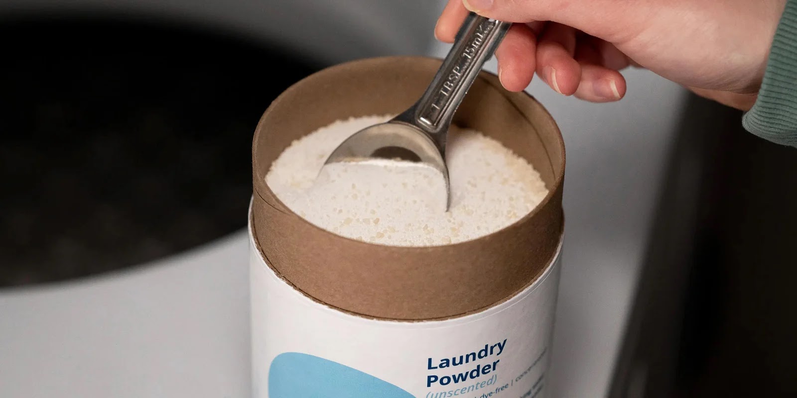
fig 2.2 Competitor
Most powder detergent brands now use tube or pouch packaging that is strong, resealable, and easy to pour. These designs keep the powder dry and are more convenient than simple plastic bottles or boxes. The packaging often uses bright colors, bold fonts, and clear labels that show key benefits like “removes stains” or “eco-friendly.”
Some brands also use recyclable or refillable materials, which appeals to younger customers who care about the environment. Overall, competitor packaging looks modern, useful, and eco-conscious, while the current packaging looks outdated and less practical in comparison.
Packaging 3 - Bee Hoon Packaging


fig 3.1 Bad Packaging 3
Product Analysis:
Market Research:
The 2025 food packaging trends clearly emphasize modern, sustainable, and consumer-friendly design, which the current bee hoon packaging does not fully embrace. According to the article, there’s a strong push toward minimalist layouts, clear labeling, and transparency, allowing consumers to easily understand what they’re buying and see the quality of the product inside. Another key trend is sustainability. Consumers in 2025 expect recyclable or compostable packaging, but the bee hoon packaging uses standard plastic with no indication of eco-consciousness. This creates a disconnect with the rising demand for circular packaging systems and environmentally friendly materials outlined in the article.In addition, smart packaging and clean label designs are highlighted as growing trends—offering features like QR codes, simplified product information, and traceability. The bee hoon packaging doesn’t leverage any of this, making it feel outdated and less informative compared to what today’s consumers expect.
Source : https://wwgourmet-copack.com/2025/01/30/top-food-packaging-trends-for-2025-and-their-impact-on-stand-up-pouches-pillow-bags-folding-cartons-and-individually-wrapped-products/


Other bee hoon brands use clear, simple, and clean packaging. Many have windows that show the noodles, along with neat designs and bold labels. Colors are usually light and natural, giving a sense of freshness. Some use eco-friendly materials or promote themselves as being more sustainable. Compared to these, the current packaging looks outdated and messy, and doesn’t stand out on the shelf. To keep up with the competition, the brand should update its packaging to be clearer, stronger, and more appealing to modern shoppers.


Visually, the design is cluttered, outdated, and doesn’t reflect the enjoyable, indulgent nature of biscuits. The colors are mismatched and not appetizing; there’s no warmth or vibrancy that would typically attract biscuit lovers. There is no appealing food photography or illustration to stimulate appetite.
The font choices are inconsistent and hard to read. Important details like flavor, quantity, or any unique selling point are not clearly highlighted. The overall layout lacks visual hierarchy, and the branding is weak or almost non-existent. It’s hard to tell what makes this biscuit different or special.
There is also no sign of eco-consciousness, like recyclable materials or sustainability claims, which are increasingly expected in snack packaging today.
Competitor Analysis:

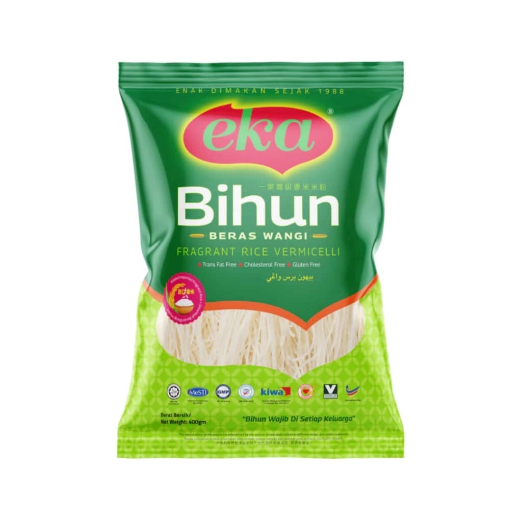
fig 3.2 Competitor
Packaging 4 - Biscuit Packaging


fig 4.1 Bad Packaging 4
Product Analysis:
The current biscuit packaging is not effective for attracting or retaining consumer interest. It uses thin, glossy plastic that feels cheap and lacks structural integrity. This kind of material can easily tear or wrinkle, offering poor protection for a fragile food like biscuits. There’s no reseal feature, which is a major convenience factor consumers now expect.Visually, the design is cluttered, outdated, and doesn’t reflect the enjoyable, indulgent nature of biscuits. The colors are mismatched and not appetizing; there’s no warmth or vibrancy that would typically attract biscuit lovers. There is no appealing food photography or illustration to stimulate appetite.
The font choices are inconsistent and hard to read. Important details like flavor, quantity, or any unique selling point are not clearly highlighted. The overall layout lacks visual hierarchy, and the branding is weak or almost non-existent. It’s hard to tell what makes this biscuit different or special.
There is also no sign of eco-consciousness, like recyclable materials or sustainability claims, which are increasingly expected in snack packaging today.
Market Research:
In 2025, biscuit packaging needs to reflect modern consumer expectations: clean design, sustainability, and clear communication. Today’s successful designs use minimalist layouts, bold but simple fonts, and natural, appetizing colors that make the product feel fresh and premium. Many brands are also adding smart features like QR codes to share product stories, ingredients, or promotions. Sustainability is especially important; shoppers now prefer recyclable or compostable wrappers over traditional plastic. Updating your packaging with these elements would not only improve shelf appeal but also build trust and align with what buyers value most today: clarity, convenience, and care for the environment.Source : https://wwgourmet-copack.com/2025/01/30/top-food-packaging-trends-for-2025-and-their-impact-on-stand-up-pouches-pillow-bags-folding-cartons-and-individually-wrapped-products/


When compared to leading biscuit brands, it’s clear that the packaging could be enhanced. Some competitors use bold, glossy boxes with large product images and strong branding, making their products instantly recognizable on store shelves-though these designs can sometimes feel dated and lack the minimalist appeal that today’s consumers prefer. Others embrace a clean, natural aesthetic with earthy colors, handwritten fonts, and clear product windows that showcase the biscuits inside. This modern, artisanal approach feels trustworthy and is especially attractive to younger, health-conscious shoppers.
After completing this exercise, I’ve gained a better understanding of what modern market packaging looks like. I realized that many products still use outdated and unappealing packaging, which can hurt their appeal. Packaging plays a crucial role in influencing purchasing decisions wether if the design is attractive and well thought out, it can significantly increase the chances of a customer choosing that product.
Competitor Analysis:


fig 4.2 Competitor


Comments
Post a Comment